Brief
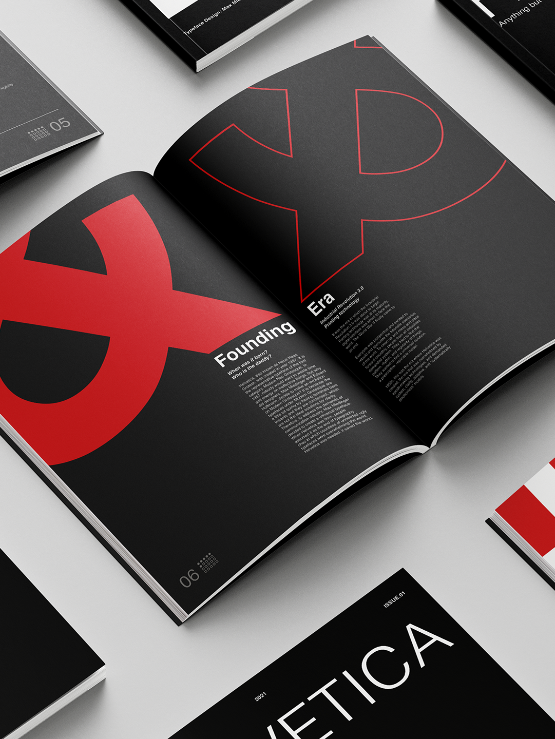
Having been introduced to Grid System by Josef Brockmann, students were commissioned to design a 16-page, A4 publication for the magazine ‘Playfully Rigid’ by Design Observer. Students were supplied with unstyled text and images. With the prescription, students would decide the typography executions such as grid system, baseline grid, paragraph and character styles, compose image placement, colour palette and so on. Attention should be given to the hierarchy, target audience (design enthusiasts worldwide), flow and consistency, dynamism, and visual language.
Having been introduced to Grid System by Josef Brockmann, students were commissioned to design a 16-page, A4 publication for the magazine ‘Playfully Rigid’ by Design Observer. Students were supplied with unstyled text and images. With the prescription, students would decide the typography executions such as grid system, baseline grid, paragraph and character styles, compose image placement, colour palette and so on. Attention should be given to the hierarchy, target audience (design enthusiasts worldwide), flow and consistency, dynamism, and visual language.
Solution
In correspondence to the contents, I designed the visual identity with a nod to Swiss Design. The comfort and excitement of design enthusiasts are mostly visual-driven, and they can get bored of long reading. I took this into account by inviting the interplay of images of different scales and arrangements, they occasionally break through the grids to suggest visual punches. The visual cue of "4*4 grid of circles" suggests the length of each article and the reading progress, which could mitigate the anxiety of long reading and signify satisfaction of completion.
In correspondence to the contents, I designed the visual identity with a nod to Swiss Design. The comfort and excitement of design enthusiasts are mostly visual-driven, and they can get bored of long reading. I took this into account by inviting the interplay of images of different scales and arrangements, they occasionally break through the grids to suggest visual punches. The visual cue of "4*4 grid of circles" suggests the length of each article and the reading progress, which could mitigate the anxiety of long reading and signify satisfaction of completion.
